
Flixta – Personal Portfolio WordPress Theme

- Description
- Reviews (3)
- FAQ

Flixta – Personal Portfolio WordPress Theme
You’re a designer, developer, photographer, or creator with projects to ship and clients to impress. What you don’t have time for is license friction when you spin up staging, clone a starter site, or hand off a finished build. This edition of Flixta – Personal Portfolio WordPress Theme is packaged for people who move quickly: activate it across unlimited websites, keep the complete feature experience intact, and stay aligned with upstream refinements so your portfolio remains stable through WordPress and PHP updates. In everyday terms: you get the polished theme you wanted—minus per-domain hurdles—so you can launch a personal site today, a landing page tomorrow, and a polished case-study hub next week without asking anyone for another key.
Beneath those operations perks is a theme that simply makes your work look better. Flixta – Personal Portfolio WordPress Theme favors confident typography, balanced white space, and image-forward layouts that highlight craft without shouting. Sections tell a story: headline → proof → project → detail → action. On phones, tap targets are generous and image ratios hold steady, so your case studies feel composed rather than crammed.
Who Flixta is for (and why it keeps getting reused)
-
Freelance designers and studios who ship brand identities, websites, product design, and need project pages that feel editorial.
-
Web developers and engineers who want clean code snippets, component galleries, and space for changelogs or tech stacks.
-
Photographers and visual artists who need galleries that load fast and maintain aspect ratios without cropping surprises.
-
Writers and content strategists who care about type rhythm, metadata clarity, and easy-to-skim article layouts.
-
Agencies that produce multiple portfolio sites per quarter and want a dependable base they can rebrand quickly and hand off cleanly.
If you maintain more than one property—personal site, experiment lab, conference microsite, maybe a template shop—this freedom to use the theme wherever you need it saves both time and budget while keeping your whole web presence coherent.
What you get out of the box
Flixta – Personal Portfolio WordPress Theme arrives with a thoughtful library of templates and blocks so you can write less HTML and make more work visible:
-
Showreel homepages with a lead hero, selected projects, clients or testimonials, and a compact “About” slice that links deeper.
-
Project case studies built around outcomes, process, and results: problem frames, before/after images, short captions, and a tidy facts sidebar (role, scope, year, tools).
-
Galleries and grids that respect image ratios, with lightbox behavior that keeps captions legible.
-
Services pages for retainers, one-off engagements, or productized offerings.
-
About/Resume layouts for bios, timelines, skills, awards, and press mentions without turning the page into a wall of badges.
-
Blog / Notes / Lab templates that support both long-form posts and short updates—with code-friendly typography when you need it.
-
Contact and booking sections that balance form fields with trust notes and normal-person language.
Every layout aligns to a consistent grid; shadows, radii, and spacing are tokenized, so the site reads as a brand rather than a collage of widgets.
Why this edition is operationally friendly
-
Unlimited activations: spin up staging, demos, side projects, and client transfers without per-domain math.
-
Full feature parity: the complete template library and customization controls are included; nothing is watered down.
-
Aligned with upstream releases: refinements and compatibility updates remain within reach, so your stack doesn’t drift.
-
Predictable cloning and handoffs: copy a site, swap brand tokens, publish—no activation callbacks breaking your Friday launch.
You’ll feel the difference after the second or third project, when shipping another Flixta site takes hours, not days.
Design system: opinionated where it helps, flexible where it matters
Flixta’s look is confident but quiet: crisp headings, generous line height, and color use that frames the work rather than competing with it. The system exposes sensible tokens:
-
Typography: choose a headline family with personality and a calm body font; monospace accents are ready for code annotations or filenames.
-
Color: one strong primary, a measured secondary, and neutral grays that make screenshots and photography sing.
-
Spacing: rhythm that scales across breakpoints so your pages feel airy on desktop and comfortable on mobile.
-
Motion: small, fast transitions for hover and reveal states; no scroll-jacking, no gimmicks.
Swap tokens once and the entire site coheres; if you need deeper control, create a child theme and keep overrides tidy.
Project pages that read like a story (not a slideshow)
A strong case study doesn’t dump assets; it narrates decisions. Flixta’s case template guides you through a sequence that buyers and peers understand:
-
The goal: one sentence about the outcome you chased.
-
Your role and constraints: one small block with scope, collaborators, tools, timeline.
-
Process highlights: two to four beats—exploration, dead ends, decisive pivot—each with a single visual and short caption.
-
Result snapshots: crisp hero after-shots with context (“component library reduced build time 28%”).
-
Reflection: one paragraph of what you’d change next time.
Captions stay readable, image ratios stay steady, and the facts sidebar keeps details handy without derailing the flow.
Galleries that respect images (and your visitors’ bandwidth)
-
Responsive sizes mean phones don’t download desktop-scale files.
-
Intrinsic ratios prevent layout jumpiness as images stream in.
-
Keyboard and swipe support make lightboxes pleasant on both laptops and phones.
-
Accessible captions ensure screen readers and skimming humans get context without extra clicks.
If your work is visual, these choices matter more than another animation preset.
Blog and notes that people actually read
Whether you publish deep dives or short field notes, Flixta – Personal Portfolio WordPress Theme keeps prose comfortable:
-
Readable measure so lines don’t stretch into the next continent.
-
Purposeful metadata (reading time, date, tags) that’s present but unobtrusive.
-
Code and callouts spaced sensibly; figures and tables carry captions that don’t break on mobile.
-
Related content nudges readers to the next useful page—like the project that post references.
If you write to attract clients or teach peers, you won’t fight the template.
Services and pricing without drama
Flixta ships with a services layout that avoids the tired “three equal boxes” trope. You can:
-
Promote a flagship offer with a longer description and clear outcomes.
-
Keep smaller services as compact cards with short bullets.
-
Add an optional process strip (“Discovery → Concepts → Build → Review”) and a compact FAQ to reduce last-mile friction.
You can show price ranges or keep it value-based; either way, the layout keeps expectations grounded.
Performance posture (built to keep Core Web Vitals green)
Recruiters and buyers often browse on constrained networks. Flixta protects their patience:
-
Clean, semantic markup with logical headings and ARIA roles.
-
Deferred non-critical scripts so content paints early and interactions stay snappy.
-
Responsive media and intrinsic ratios to protect Largest Contentful Paint.
-
Minimal layout shift—cards, buttons, and images don’t jump as assets arrive.
Add basic caching and image compression and you’re set up for healthy metrics without acrobatics.
Accessibility and internationalization
Good portfolios are inclusive:
-
Contrast-aware palettes and visible focus states make navigation sane for everyone.
-
Skip links and clear landmarks help assistive tech.
-
Keyboard-friendly components avoid hover-only traps.
-
Localization-ready strings and layouts that tolerate longer words in translated interfaces.
These choices help you, too—sites that are easy to navigate convert better.
SEO foundations (without gimmicks)
Discovery still matters, even for portfolios. Flixta gets the basics right:
-
Taxonomy clarity for projects, categories, and tags so archives have purpose.
-
Schema-friendly layouts for articles and breadcrumbs.
-
Skimmable sectioning that aligns with how people search (“brand identity system,” “Next.js case study,” “product redesign process”).
-
Internal linking that promotes cornerstone projects and keeps readers moving.
When your content is specific and honest, search engines have what they need.
Multisite, multi-brand, and agency scenarios
Here is where this edition shines:
-
One base, many properties: your personal site, a template storefront, a speaking page, and experimental labs.
-
Client handoffs: deliver a finished portfolio; it keeps working on the client’s domain without license steps.
-
Blueprints: keep a “starter Flixta” with your favorite sections; clone it for collaborators or new ventures in minutes.
-
Staged updates: test upstream-aligned refinements once, roll them everywhere with confidence.
When your creative life spans multiple sites, this simplicity is priceless.
A practical setup runbook (first 48 hours)
-
Install & activate the theme on a staging URL.
-
Set brand tokens: choose a primary color, pick headline/body type pairs, set button radius and card shadows.
-
Assemble the homepage: hero line with one clear promise, three featured projects, one proof strip (logos or testimonial), a short “About,” and a concise contact callout.
-
Publish two case studies: one flagship, one fast turnaround; keep copy concrete, captions short, and images consistent.
-
Add a Services page with outcomes-first copy; include a compact FAQ near the CTA.
-
Write an About/Resume page with a one-paragraph bio, timeline of highlights, and a human photo.
-
Seed the blog/notes with two entries (a process lesson and a behind-the-scenes).
-
Performance pass: enable caching, compress images, and remove any unused third-party scripts.
-
Accessibility pass: verify contrast, tab order, and focus rings.
-
QA on mobile first, fix any overflow in galleries or code blocks.
-
Go live, then iterate weekly; small improvements compound.
Content prompts that make case studies easy to write
-
Context in one line: “Fintech app redesign to cut onboarding drop-off.”
-
Constraints: “Two-week sprint, legacy API, iOS first.”
-
Decision point: “We dropped the carousel; moved to three static frames with captions.”
-
Result: “Onboarding completion +34% within six weeks.”
-
Reflection: “Next, I’d modularize the form steps to test order variations.”
Paste these beats into the case template and your study reads like real work, not a mood board.
Tips for a portfolio that feels handcrafted (not corporate)
-
Vary paragraph lengths; avoid a hypnotic grid of identical blocks.
-
Use captions that say why an image matters, not just what it is.
-
Keep CTAs concrete (“Request a project scope,” “See the component library”).
-
Show a messy mid-process screenshot at least once; it makes the polished result believable.
-
Refresh the homepage quarterly; retire older work so the present shines.
Flixta’s defaults encourage this rhythm; the result is quietly persuasive.
Developer notes (for clean diffs and calm updates)
-
Child theme ready for template overrides and bespoke sections.
-
Hooks and widget areas let you add analytics, pixels, or experiment code without editing core files.
-
Predictable partials (headers, footers, nav, cards) keep CI/CD and code review straightforward.
-
Lean dependencies mean if the site slows, it’s likely oversized media or extra scripts you added—not the base.
All of which is to say: you stay in control.
Frequently Asked Questions
Q1: Do I get the complete features of Flixta – Personal Portfolio WordPress Theme?
Yes. You receive the full template library—home, projects, galleries, services, about/resume, blog/notes, contact—and all customization controls. Nothing is held back.
Q2: Can I use it on unlimited domains and subdomains (including staging)?
Yes. Activate it across personal sites, experiments, client deliverables, staging copies, and microsites without per-domain hurdles.
Q3: How do updates work?
Your installation stays aligned with upstream releases so refinements, compatibility fixes, and visual polish remain within reach. You aren’t stuck on one version.
Q4: Will my brand and template overrides survive updates?
Keep overrides in a child theme and set brand tokens in global styles; updates then stay routine and predictable.
Q5: Is it suitable for WordPress Multisite?
Absolutely. It’s a strong fit for portfolios with multiple sub-brands, languages, or experimental labs sharing one codebase.
Q6: Can non-technical collaborators update pages?
Yes. Editors can swap hero copy, add projects, and publish notes with a few clicks; the layout guards against easy breakage.
Q7: How does this edition help agencies and collectives?
One predictable purchase covers unlimited deployments and complete features, making demos, handoffs, and regional variants simple—and budgets calmer.
Q8: What about performance for image-heavy portfolios?
Flixta is built with responsive images, intrinsic ratios, and cautious scripts. Pair with caching and compression and your galleries stay fast.
Q9: Does it handle long-form writing as well as visuals?
Yes. Typography, spacing, and figure handling keep essays readable. Code blocks and callouts are styled to help technical posts.
Q10: What’s the best way to structure a services page?
Lead with outcomes (“Launch a crisp brand site in 10 days”), list what’s included, share 1–2 proof points, place a compact FAQ near the CTA, and link to 1–2 relevant case studies.
Closing thoughts
A portfolio lives or dies on clarity: what you do, why it matters, and proof that you can deliver again. Flixta – Personal Portfolio WordPress Theme respects that reality. It gives you structure that flatters your work, performance choices that keep pages fast everywhere, and a writing rhythm that feels human. This edition adds the operational freedom modern creators and agencies need: activate on unlimited sites, keep complete feature parity, and track upstream improvements so maintenance stays boring—in the best possible way.
If the next quarter includes revamping your personal site, publishing three new case studies, launching a productized service page, and spinning up a small lab for experiments, you can do all of it on the same dependable foundation—confident that your site will look sharp, read well, and keep pace with your work.
Share Your Valuable Opinions
Q: Do I need a license key?
A: No. All products are Pre-Activated. You can use 100% of the Premium features immediately.
Q: Can I use the One-Click Demo Import?
A: Yes, absolutely! We ensure the demo import feature works perfectly.
Q: Can I use the products on multiple websites?
A: Absolutely. The GPL license allows use on unlimited domains.
Q: Are the files safe?
A: Yes. All files are scanned by McAfee and VirusTotal before uploading.
Share Now!
Latest Products
 Flutex – Perfex CRM Admin/Staff Mobile App for Android & IOS | Flutter App with API Module Included$5.00
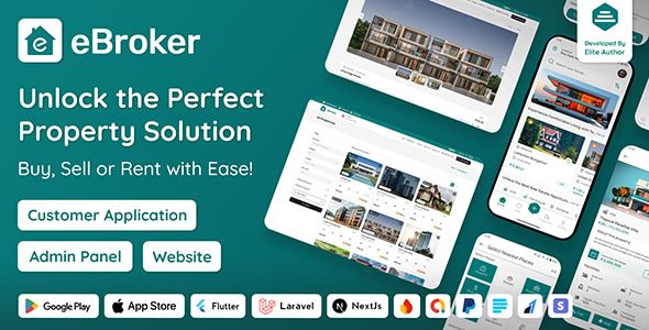 eBroker – Real Estate Property Buy-Rent-Sell Flutter app with Laravel Admin Panel | Web Version$5.00
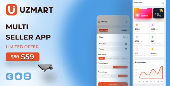 Uzmart – Seller app$5.00
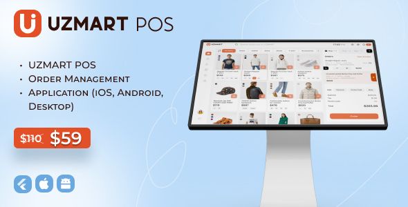 Uzmart POS + Order Managment (iOS, Android, Desktop)$5.00
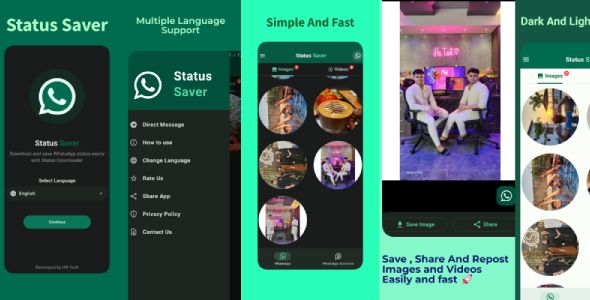 Whatsapp Status Saver – Video Download$5.00


Related Products
No posts were found.
Same Contributor


Featured Products


Thx.
Valid license.
My agency loves Flixta – Personal Portfolio WordPress Theme.