
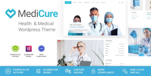
Dispnsary – Medical and Health Care WordPress Theme

- Description
- Reviews
- FAQ

Dispnsary – Medical and Health Care WordPress Theme
Version advantages up front. This edition of Dispnsary – Medical and Health Care WordPress Theme is delivered in a freedom-first license package that’s ready to use right after install, includes all premium features, supports unlimited websites with a one-time purchase, and stays in step with the official release for ongoing updates. In plain English: you can launch a clinic site this week, spin up a telehealth microsite next month, and open specialty landing pages for new locations—without domain locks, seat limits, activation servers, or renewal surprises. Feature parity and update cadence mirror the upstream build, so compatibility and security improvements keep arriving while you grow.
Product Overview
Dispnsary – Medical and Health Care WordPress Theme is purpose-built for hospitals, clinics, private practices, ambulatory centers, labs, dental groups, allied health providers, and telemedicine startups that need a website patients can actually use. Pages are structured like a good front-desk conversation: what you treat, who provides care, how to book, what to expect, and how to reach you—supported by clear insurance notes and accessible design.
The visual language is clinical without being cold: calm color tokens, generous white space, legible type at medical-friendly sizes, and iconography that guides anxious visitors instead of decorating the page. Templates include Departments/Specialties, Find a Doctor, Provider Profiles, Appointments & Telehealth, Locations, Insurance & Billing, Patient Education/Blog, Clinical Trials or Programs, Careers, About/Accreditations, Contact/Triage, and Accessibility & Privacy pages. Because all premium blocks are included, you’re not chasing paywalled components to finish your IA; and because usage is unlimited, multi-site health systems and agencies can standardize on Dispnsary across regions with one update cadence that syncs to the official release.
Who It’s For
-
Multi-specialty clinics & hospitals needing many departments, provider directories, and schedule clarity across locations.
-
Private practices (family medicine, pediatrics, OB-GYN, cardiology, ortho, derm, GI, uro, ENT, pain, psych/behavioral health) seeking fast appointment flows and transparent expectations.
-
Dental & oral surgery groups with treatment menus, financing FAQs, and before/after galleries handled tastefully.
-
Urgent care & retail care where mobile users need directions, open hours, and wait-time context above the fold.
-
Telemedicine & hybrid care offering video visits, e-consults, refill requests, and remote monitoring sign-ups.
-
Allied health (PT/OT/SLP, chiropractic, nutrition, imaging, labs) requiring clear prep instructions and safety notes.
-
Health systems & agencies deploying a fleet of coordinated sites—unlimited usage and update parity make standardization realistic.
Core Philosophy
-
Reduce patient anxiety with clarity. Plain language beats jargon; show what happens before, during, and after a visit.
-
Put the next step within thumb reach. Every screen should end with Book Appointment, Call Now, Find a Location, or Message Us.
-
Design for accessibility first. Text sizes, contrast, focus states, and motion preferences come standard; icons are signposts, not ornaments.
-
Speed is part of care. Predictable layout, pre-sized media, and opt-in effects keep pages responsive on clinic Wi-Fi and mobile data.
-
Reuse beats rework. One provider card or appointment widget should live on Home, Departments, and Location pages without redesign.
What You Can Build (and Why It Works)
1) Departments & Services that speak human
Create a Departments hub (Primary Care, Pediatrics, Women’s Health, Cardiology, Orthopedics, Behavioral Health, Dentistry, Imaging, Lab, Urgent Care). Each department page uses a steady, patient-friendly flow:
-
Conditions we treat (plain terms, alphabetized or grouped).
-
What to expect (visit length, testing, prep instructions, follow-up).
-
Who you’ll meet (providers with concise bios and languages spoken).
-
How to prepare (documents, fasting, medications, insurance card).
-
When to call 911 vs. when urgent care is enough (simple triage).
-
Book/Call CTA, visible on first scroll.
2) Provider Profiles that build trust quickly
Provider pages show credentials without drowning the reader. Above the fold:
-
Photo with consistent crop, name & role, specialty, languages, locations, new patients? yes/no.
-
Book now and Call office buttons that inherit location context.
Below, short biography, clinical interests, education/training, board certification, memberships, insurances accepted, and patient instructions where relevant (e.g., “Stop certain supplements 7 days before procedure—see prep sheet”).
3) Appointment & Telehealth flows that convert
-
Step 1: choose in-person or video.
-
Step 2: select reason for visit (short list; “Other” if needed).
-
Step 3: location + date/time or first available.
-
Step 4: patient details (essentials only) + insurance photo upload (optional).
A small reassurance strip—“We’ll confirm by email/text. You can reschedule from your confirmation”—lowers anxiety. For telehealth, add device/test link and a quiet-hours note.
4) Locations that actually help people arrive
Each location page includes address (tap-to-map), parking/access notes, hours, contact numbers, transit tips, onsite services (lab, X-ray), and a photo of the entrance. A Today’s availability chip (open/closed; same-day slots?) helps urgent users decide.
5) Insurance & Billing without riddles
A clean, factual page:
-
Plans accepted (grouped by network), out-of-network options, self-pay rates for common visits, and financial assistance notes.
-
How billing works (copay vs. co-insurance vs. deductible) with one illustrative example, not math games.
-
Estimate requests form for elective procedures.
-
Questions? A calm contact option with expected response window.
6) Patient Education that respects time
Create short explainers: “What to expect at your first cardiology visit,” “MRI preparation,” “Colonoscopy prep checklist,” “Behavioral health intake—what we ask and why.” Use bullet lists, quiet diagrams, and an optional print-friendly version.
7) Careers that sound real
Role cards (RN, MA, Tech, Front Desk, Billing, NP/PA, MD/DO), shift patterns, benefits highlights, training support, and a respectful application form. Include your values in practice (“We run debriefs after high-stress shifts”).
8) Programs & Trials (optional)
If you run programs (diabetes education, cardiac rehab, smoking cessation) or clinical trials, add eligibility criteria, schedule cadence, what’s expected of participants, and a contact.
Information Architecture That Works for Healthcare
Homepage
Hero with one task bar (Find a Doctor / Book / Find a Location) → service/department tiles → urgent/after-hours band → provider spotlights → insurance/billing teaser → patient education strip → reviews (measured and tasteful) → final CTA.
Departments (hub)
Search + filter by specialty, condition, or age group. Cards show a short value statement and a Book button.
Find a Doctor
Filters for specialty, condition, language, location, gender (optional), accepting new patients, and telehealth availability. Results show photo, titles, locations, next available.
Provider Page
As above; keep bio honest and jargon-light.
Appointments
Four steps, minimal fields, expectations set.
Locations
Map, parking, transit, hours, on-site services, accessibility notes.
Insurance & Billing
Plans, self-pay, assistance, estimate request, billing FAQ.
Patient Education / Blog
Collections by topic (Heart, Women’s Health, Kids, Mind, Bones/Joints, Dental, Imaging/Lab, General Wellness). Each post has prep lists or checklists where useful.
Contact/Triage
Phone, message form, and a When to call emergency services panel in plain language.
About / Accreditations / Safety
Leadership, history, accreditations/quality programs, infection prevention basics, and a patient rights statement.
Accessibility & Privacy
Explain how your site and practice support accessibility and privacy in human terms. (This is informational; it is not legal advice.)
Design System & UX Notes
-
Typography: Medical-grade legibility. Headings clear and confident; body sized for relaxed reading.
-
Color tokens: Calm neutrals, a single action color for CTAs, success/warning chips for states (open/closed, available today).
-
Iconography: Stethoscope, calendar, map pin, phone, video, lab beaker, tooth, heart, bone, shield, wheelchair. Used sparingly.
-
Photography: Real spaces, real teams, real equipment. Patients depicted with dignity and consent.
-
Microcopy: Replace “state-of-the-art” with specifics (“Same-day X-ray, results in portal by 6 pm”).
-
Accessibility: Contrast, focus states, keyboard paths, and reduced-motion respected out of the box; alt text should convey meaning (“Ramp entrance at east lot, automatic door”).
Setup & First Launch
-
Environment
Use a current WordPress/PHP version, enforce HTTPS, configure transactional email, and define image sizes with width/height to prevent layout shift. -
Install Dispnsary – Medical and Health Care WordPress Theme
Upload, activate, and import starter layouts: Home, Departments, Find a Doctor, Provider, Appointments, Locations, Insurance & Billing, Patient Education, Careers, About, Accessibility & Privacy, Contact. -
Brand Tokens
Set primary/action/neutral colors and heading/body fonts once in Global Styles. Tokens keep rhythm consistent across dozens of pages. -
Homepage First Draft
Task bar → top departments → provider spotlights → insurance/billing teaser → patient education strip → final CTA. -
Directory & Providers
Add providers with standardized photos and concise bios. Tag languages, locations, and acceptance status for filters. -
Appointment Flow
Create reasons for visit, telehealth toggles, and optional insurance upload. Write confirmation microcopy with clear reschedule rules. -
Locations
Duplicate the location template for each site; add parking/entrance notes and a recognizable exterior photo. -
Insurance & Billing
List plans accepted; include self-pay bundles for common visits. Add a short glossary for copay/deductible/co-insurance. -
Performance Pass
Pre-size hero images, lazy-load galleries, defer non-critical scripts, and test on a mid-range smartphone. Dispnsary is light—keep it that way.
Content Strategy: First 45 Days
-
Week 1: Launch Home, Departments, Find a Doctor, three Provider pages, Appointments, one Location, Insurance & Billing, and Contact.
-
Week 2: Add two more Locations, six Provider pages, and three Patient Education articles with printer-friendly versions.
-
Week 3: Publish specialty pages (e.g., Women’s Health, Orthopedics) with prep lists and a small FAQ each.
-
Week 4: Introduce Telehealth details, including device checks and etiquette (“Quiet space, ID ready”).
-
Week 5–6: Build Careers with two real stories; add Financial Assistance and an Accessibility statement. Refresh photos for consistency.
Patient-Centered Copy Patterns (Steal These)
-
Prep note: “Please don’t eat or drink for 8 hours before your appointment. Take regular medications with a small sip of water unless your clinician advised otherwise.”
-
Expectation setting: “Your first visit lasts 45–60 minutes. We’ll review history, examine, and plan next steps together.”
-
After-visit: “Lab results post to your portal in 1–3 days. We’ll call if anything needs urgent attention.”
-
Triage: “Call emergency services for chest pain, severe trouble breathing, or heavy uncontrolled bleeding.”
Telehealth, Messaging & Portals (Positioning)
Dispnsary accommodates telehealth CTAs, messaging links, and portal sign-ins, but the theme itself is not a medical device or message repository. Use it to present options clearly, link to your existing systems, and explain what each channel is for. Keep expectations explicit: response windows, what to send vs. what to call about, and privacy reminders. (Again: informational, not legal advice.)
Performance & SEO Guardrails (for your site)
-
Core Web Vitals: define media sizes, avoid heavy carousels above the fold, and keep scripts minimal.
-
Structured headings: H1 = page topic; H2s reflect patient intent (“Symptoms we treat,” “How to prepare,” “Insurance we accept”).
-
Internal links: Departments ↔ Providers ↔ Locations ↔ Appointments ↔ Billing; keep loops logical.
-
Local signals: Each Location page shows address, hours, phone, and a short neighborhood description.
-
Freshness: Update patient education monthly; date posts clearly and surface “last updated” where guidance can change.
Security, Privacy & Accessibility (What the Site Communicates)
-
Privacy summary: what you collect on forms, why, how long you keep it, and who to contact.
-
Email deliverability: configure auth so confirmations reach the inbox.
-
Role-based access: staff logins should be unique; use strong passwords and multifactor.
-
Backups: nightly; test restores quarterly.
-
Accessibility: describe site support (contrast, focus, keyboard, alt text, reduced-motion). Offer a contact for accessibility feedback.
(The website is an information channel; operational privacy and compliance responsibilities remain with your organization.)
Multi-Site & System-Wide Operations
Because this package includes all premium features, supports unlimited sites, and syncs with the official release, a health network or agency can:
-
Maintain a main brand site, department minisites, and regional location sites with shared tokens.
-
Reuse provider cards, appointment flows, and billing notes across properties.
-
Clone a telehealth microsite quickly with consistent guidance.
-
Run one monthly update cadence for the entire fleet.
Maintenance & Update Rhythm
Updates track the official release so compatibility and security refinements keep arriving. A calm routine works:
-
Clone production to staging.
-
Update the theme; skim the changelog.
-
Visual QA: Home, Find a Doctor, one Provider page, Appointments, Locations, and Insurance & Billing.
-
Deploy during a low-traffic window; purge cache/CDN.
-
Re-test on mobile; ensure forms submit, confirmations send, and analytics fire once.
Keep styling in Global Styles or a child theme so updates don’t overwrite your work.
Troubleshooting
-
Forms not submitting → Exclude endpoints from full-page cache; ensure nonces are fresh; verify HTTPS canonicalization and any human-verification token.
-
Layout shift on mobile → Define width/height on hero media; avoid auto-loading sliders; preload the display font.
-
Soft staff photos → Export at correct breakpoints; avoid double compression; keep consistent lighting and crop.
-
Duplicate analytics events → Use one tag manager; remove legacy per-page snippets.
-
Icon misalignment → Prefer inline SVG; normalize baselines; avoid raster icons in labels.
-
Translation gaps after update → Re-scan strings; re-sync catalogs; keep slugs aligned per language.
-
Slow first paint → Compress hero assets; defer non-critical JS; lazy-load galleries; limit embeds near the top.
Licensing Advantages (Plain-English Recap)
-
Unlimited websites: main system, regional sites, program microsites—no activation hoops.
-
One-time purchase: predictable budgets; no per-domain renewals.
-
All premium features included: department layouts, provider directories, appointment flows, location templates, insurance/billing pages, patient education, careers, and more.
-
Updates synced to the official release: compatibility and security fixes arrive on schedule.
-
Ready after install: no serial servers or domain locks—activate and build.
-
Agency-friendly: standardize a base build and replicate rapidly for multiple clinics or networks.
Launch Checklist
-
Set brand tokens (colors, type, spacing) in Global Styles.
-
Publish Home, Departments, Find a Doctor, Provider (3+), Appointments, Locations (1+), Insurance & Billing, Contact.
-
Add authentic photography (entrances, waiting rooms, equipment).
-
Configure appointment confirmations and email authentication.
-
Write three Patient Education articles with prep lists.
-
Create an Accessibility and Privacy summary.
-
Test the booking flow on a real phone; verify totals and confirmations.
-
Enable backups and schedule a monthly update window.
FAQ
1) Can I deploy Dispnsary – Medical and Health Care WordPress Theme on unlimited sites?
Yes. This package supports unlimited sites with a single purchase—ideal for multi-location networks and program microsites.
2) Are all premium templates and blocks included?
Yes. Departments, provider directories, provider profiles, appointment & telehealth flows, locations, billing, patient education, careers, about, accessibility, and contact are all included.
3) Will I keep receiving updates?
Yes. The theme stays in step with the official release, bringing compatibility and security refinements routinely.
4) Do I need activation keys or domain binding?
No. It’s ready right after install—no domain locks, serial servers, or renewal gates.
5) Is this suitable for telemedicine?
Yes—use telehealth visit types, device-check tips, and clear etiquette notes. The site presents options; clinical platforms handle the session itself.
6) Can I show accepted insurance plans and self-pay rates?
Absolutely. Use the Insurance & Billing layout for plans accepted, self-pay bundles, assistance info, and a request-an-estimate form.
7) How does the provider directory work?
Filter by specialty, condition, language, location, telehealth, and accepting-new-patients. Provider pages include Book and Call CTAs that inherit context.
8) Is there a way to post pre-visit instructions or prep lists?
Yes. Patient Education posts and “How to prepare” blocks keep instructions short, printable, and easy to skim.
9) Will updates overwrite our brand customizations?
Keep changes in Global Styles or a child theme; test updates on staging before deploying.
10) Can I run multi-language sites?
Yes. Translate UI strings, mirror navigation per language, and keep slugs aligned. Update provider bios consistently across locales.
11) How do I keep pages fast for anxious mobile users?
Pre-size images, use next-gen formats, avoid heavy sliders above the fold, and keep scripts minimal.
12) Can I add reviews or testimonials?
Yes—use a measured strip with short, specific comments. Keep tone factual and respectful.
13) Does the theme help with compliance?
It provides accessible, privacy-aware presentation patterns and clear information architecture. Operational compliance remains your organization’s responsibility.
14) How should I write department pages?
Lead with conditions treated, who you’ll meet, what to expect, prep notes, and when to seek emergency care. End with Book and Call options.
15) Can I post job openings?
Yes. Careers pages include role cards, shift info, benefits, training notes, and a tidy application form.
16) How do I reduce no-shows?
Set expectations on confirmation pages, offer easy rescheduling, and add a short “How to prepare” checklist to appointment emails.
17) Is there support for labs and imaging?
Yes. Use department templates with prep lists (fasting, metal objects, contrast dye) and result-delivery timelines.
18) Can I embed wait-time indicators?
You can add an availability chip or manual updates. Keep language calm and honest.
19) What about urgent care vs. emergency guidance?
Include a simple triage note on relevant pages. Present as general guidance, not diagnosis.
20) How do I manage many providers without chaos?
Standardize bios, image crops, and tags (specialty, languages, locations). Filters do the rest.
21) Does Dispnsary handle refills or medical messaging?
The site can present links and instructions; your clinical systems handle refills and messages.
22) Can I publish clinical trials?
Yes. Use the Programs/Trials pattern for eligibility, schedule, participant expectations, and contact.
23) How do I keep patient education accurate?
Date posts, include a gentle “not a substitute for personal medical advice” note, and review quarterly.
24) Is there a recommended launch cadence?
Ship core pages first, then add depth weekly: more providers, more locations, three education posts per month, seasonal notices as needed.
Q: Do I need a license key?
A: No. All products are Pre-Activated. You can use 100% of the Premium features immediately.
Q: Can I use the One-Click Demo Import?
A: Yes, absolutely! We ensure the demo import feature works perfectly.
Q: Can I use the products on multiple websites?
A: Absolutely. The GPL license allows use on unlimited domains.
Q: Are the files safe?
A: Yes. All files are scanned by McAfee and VirusTotal before uploading.
Share Now!
Related Products


Related Products


Same Contributor

Featured Products


